
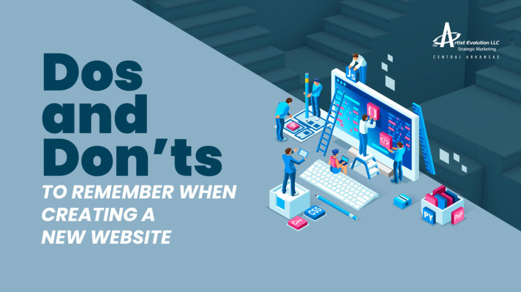
Dos and Don’ts to Remember When Creating a New Website
Whether you’re creating an all new website for your burgeoning business or launching a new website to revamp an established brand, it always feels like a daunting task. It’s virtually a blank slate and you need to decide how you would like to fill it, and with what.
That’s why we want to take some time to break it down for you, to ease your anxieties and help you through the process. First off, you don’t have to do it alone. There are many professional web builders who can help you along the way, whether you choose to go with a freelance designer or an actual agency is up to you and your budget. But bottomline: don’t stress, it’s not going to be as overwhelming as it seems.
Even if you are having the website designed for you, there are some things you should be prioritizing, and looking for, to ensure your site’s success. That’s what we’re talking about in this article: 4 of the primary goals you need to incorporate in your website creation process and the dos and don’ts associated with each. So, here are the dos and don’ts to remember when creating a new website.
- User Experience & Design
First and foremost your website needs to look good, have a decent page load time and be easy to navigate. Do not skimp on your user experience and overall design. The ultimate goal of your site is to get users to visit and stay a bit. If it’s frustrating for users to find what they’re looking for or if your page loads slowly… or even if it’s harsh to look at, visitors will drop your website like a hot potato… and probably won’t be back. Here are some dos and don’ts to consider when designing your webpage for functionality and style.
Do- Be creative and use quality visuals
Your website gives visitors a quick look inside your brand. For the same reason you would plan out an appropriate outfit before going to a job interview, you want to think about the impression your page makes on those viewing it. You want your website to look and feel good. This means using high-caliber visuals, designing for balance using excellent-quality, eye-catching photography/graphics/art. If you incorporate videos on your webpage, the same rules apply. Don’t skimp on quality. One on-point, well-made video can take your brand farther than 100 subpar alternatives.
Don’t- Overstimulate and distract visitors
While it’s important to be creative, it’s as important to not be distracting. A tastefully placed image or graphic is good, but too many images and graphics will make your site look overwhelming, not to mention is sure to slow down your load times. Shoot for creating a balance between visually interesting and sleek. Remember: even if your site is promoting graphics and artwork, it’s still possible to show too much!
Do- Plan your site’s navigation
How visitors are able to travel through your website might be the single most important facet to website creation. Basically, it can’t be hard. You have to, must, use established user experience practices and common sense to create an easy flow to your site’s navigation. One rule to remember, don’t overload your navigation bar. Keep is simple while including the most important/most visited pages. Another thing that’s integral to site navigation is including a search bar feature. That way if something isn’t easily found, visitors still have that safety net and will possibly stay on your site, instead getting discouraged and immediately exiting.
If you’re looking for some help along the way, try the tool Milanote.
Don’t- Be sloppy
Don’t be sloppy sounds simple enough. But, there are many different facets that can interfere with a clean website design. Here are a few.
First, using hard to read fonts. You need to get your message across, don’t let a simple thing like font choice get in the way of a good message. There are many fonts that aren’t so easy to read on a screen so make sure you’re using a good option that is complementary to your overall design. To learn more on fonts ideal for web design, click here.
Other things that help with your overall design: avoiding big walls of text, distracting colors, linking to other pages on your site that open in new tabs, forcing horizontal scrolling, using hijack scrolling, showing too many stock/generic images and too many pop-ups. To name a few.
Do- Encourage visitors to scroll
You want a website that keeps visitors wanting more. You can achieve this with clever design tactics that encourage users to keep scrolling. Treat it like you’re teasing a story, so pretend you’re creating a commercial that’s meant to get people to tune-in to a new show. What is the main event? Want to learn more? Keep users scrolling down to keep them on your page for longer and to create an overall compelling website that engages your audience.
Don’t- Forget about mobile
It’s hard to imagine anyone actually forgetting about mobile users, given they account for the majority of website visitors, but it’s so important that it’s worth a brief mention. Although you will, most likely, be designing your site on a larger screen, your website site has to be mobile-friendly. Meaning it has to convert to mobile-friendly usability when viewed from those kind of devices. If you don’t know how to achieve this yourself, there are countless web designers that will be happy to assist.
Do- Have calls to action
Having a call to action is perfect for sites pushing a promotion or trying to understand their audience better. For example, the classic “submit your email address for 20% off” or a link to your “new winter collection.” Users expect calls to action and many are visiting your site for promotions so will be happy for the ease of access. Just don’t overload your visitors. Keep it to just a couple of the most relevant actions you’re looking for at any given time.
Don’t- Be too salesy
That being said, don’t insult your web viewers. Don’t push the sale too hard. Have the attitude “I have a great product, service, concept and once viewers understand what I’m selling, they can make informative decisions on their own.” Your website is a persuasive selling tool but just as you don’t want to be pushy with customers in-person, you don’t want to be pushy virtually either. Simply focus on communicating why you’re the best option and make it easy for users to contact you.
Do- Think about the design details
Think about the details. A good website isn’t going to be designed in a day and you want to give yourself, and your team, the time to get it right. Consider the details that will set your website apart. Create the appropriate white space needed for a good flow, think about a color scheme that is aligned with your brand and doesn’t sacrifice visual appeal/readability. Now’s the time to think about these things, so give yourself room to get it right.
Don’t- Fall for trendy gimmicks
Don’t buy-into trends without considering the consequences. For example, using gifs and loud colors might seem like good attention-getters, but those are also sure to distract and have a big impact on your oh-so-important page load times. This isn’t to say that all trends are bad. Just think about what you’re doing before you do it, and don’t sacrifice other design edicts for the sake of a gimmick.
Do- Test it out
You’ll want to test out your design, and don’t get too attached if your first, or first few attempts aren’t working. Google Analytics is your friend and if the data shows pitfalls in your website’s design, trust the data. This is how you’ll know if people are staying on your site and where/when they choose to exit, giving you an important look into the brain of your users. Be sure to test what works, stay adaptable, track the data and pivot when necessary.
- Branding
Another factor to consider when creating your website is how it should be aligned with the brand you’re promoting.
This means making sure you incorporate your brand’s style guide when creating your website. If you don’t have a style guide for your brand, this is the ideal time to create one. That way, your messaging is consistent across all platforms. I.e. incorporating the appropriate pantones for your brand’s signature colors, using the correct logos/fonts and avoiding words and phrases that don’t represent the brand. Of course, some things might have to be adjusted. For example, if your style guide has fonts that don’t convert well to web. Here are a few dos and don’ts to remember.
Do- Be consistent with your brand’s personality
Your website is a pitch of sorts, and you want to highlight your brand’s personality. Design and copy choices should be made with personality in mind. If you’re promoting an outdoors brand then there should be that rugged, outdoorsy feel throughout your site. If it’s a luxury brand you’re promoting then you’ll want to pay close attention to creating a sophisticated feel with your design choices. Bottomline: the site’s personality and your brand’s personality need to be in harmony.
Don’t- Neglect your brand’s best attributes
Don’t neglect your brand’s best attributes. What we mean by this is to use design choices to best promote what your brand actually is/does. If you’re promoting your photography business, for example, you’ll of course want to have more original imagery on your site (without overdoing it and creating a problem with load times). If you’re promoting a new piece of equipment then you’ll want to be sure to have a video or infographic on how it works. What is your audience looking for and how can you deliver that information most efficiently?
Do- Include your brand’s story
Including a brand story is a great way to get its message out there as a stalwart model that curious visitors can keep going back to. This is your chance to explain how your brand came about, what its mission is and your vision for its future. Take the time to creatively, and concisely, explain your brand’s purpose, values and personality.
Don’t- Forget to use the tool’s at your disposal
Don’t forget that your website comes with tools so you can continue promoting your brand far after your go-live date. For example, your blog can be used to continue the business of branding and should match its personality and goals. Which brings us to our next section…
- Content
Your site is a platform that can showcase what your brand is all about and what better way to do that than with fresh content that keeps visitors coming back. One way to produce new content is through your blog, but you can also use videos, infographics and other creative tools to take your site to the next level. Here are some dos and don’ts to content development.
Do- Create fresh content
Don’t let your site get stale. Create a content development calendar and keep it coming. Fresh content engages users, gives you something you can share/promote via email/social media, drives visitors to your site and keeps them on your site for longer. Not to mention keeps them coming back.
Don’t- Publish big walls of text
Believe it or not, people don’t like to read that much. Or at least don’t want to feel like they have a huge amount of reading to do. It feels like homework. So when you publish a post, make sure it’s broken up into easy-to-read sections. That way if a reader is just looking for a certain topic within the overall topic, they can find it easier. This also encourages people to keep reading and is flat-out easier on the eyes.
Do- Have a trove of evergreen content
What are some topics you can cover that you know your audience is interested-in and will keep coming back for? Delve into these topics with quality, evergreen content and publish, and re-publish. This will save you some work and the increased traffic to these pages tells Google your site is an expert on the topic(s). Which also increases your SEO.
Don’t- Try to cover too many topics at once
Hone-in. You’ll need all the ideas you can dream up, so don’t spend too much time on a wide array of topics. Think of something really specific, create a great headline and work on fleshing out that one thing. You’ll have plenty of time for all the tertiary topics later, and you’ll be happy to have the content.
- SEO
Last but not least, SEO. You need to be thinking about search engine optimization from the get-go and create a site that supports your SEO-goals from the beginning. There’s a plethora of things that go into making a site good for SEO, including: keywords, backlinks, traffic, alt tags, regular new content and metadata. For example, metadata is information you can insert into the bones of your site at the design level that increases SEO. You should be thinking about metadata during the creation process. Here are some things you need to know about metadata and why it’s so important for SEO. And, here are a few more dos and don’ts you should know.
Do- use keywords
Keywords are popular words and phrases that your target audience searches for. You’ll want to sprinkle these keywords throughout your site, so Google identifies your site as a leading expert in the topic and pairs your site with the searches, leading to increased search engine appearances. You can use Google Analytics to find searches your audience most uses, and create keywords based on that data.
Don’t- use too many keywords
But, you don’t want to use too many keywords or too often. This is considered keyword stuffing, and actually has the reverse effect of increasing SEO. Google bots identify the overuse as unnatural, and you’ll appear lower on search appearances. So find keywords and use them where they make sense, but don’t overdo it.
Do- Create a network of links
Linking to other pages on your site, and linking to other reputable sites, is a great way to increase SEO. One thing you should remember: if you’re linking to an external site then it needs to be a good source. Linking to sites of disrepute will have a negative impact on SEO. But, when you’re creating content, keep linking in mind. Always try to add some internal and external links within your content to give it an added boost.
Don’t- Have broken links on your site
While linking is great, having broken links is not great. Google bots aren’t fond of broken links. So, be sure to make a habit of checking links to make sure they still work. Need some help? Check out these tools that will help you scan for broken links.
SEO is a complex topic, one we can’t cover in a single section. We recently delved deeper into the top of SEO and what you can do to improve your site’s search appearances. To learn even more on the topic check out 13 Ways to Improve Your Site’s SEO.
Creating a website isn’t a simple task. There are many things you can get wrong, and there are a lot of steps that go into it beyond the obvious. Remember we’re here to help. Don’t hesitate to reach out for advice and be sure to check out our collection of tips and resources, here.
Leave a Reply
Want to join the discussion?Feel free to contribute!